
Overview
Building the CE Credit Solutions website began with a clear goal: to create a sleek, professional platform that makes financial education easy to access and understand. From the ground up, the site was designed with people and professionals in mind—clean layout, mobile-friendly design, and intuitive navigation. We brought the brand to life through tailored visuals and streamlined content, while integrating essential tools like course info, registration forms, and SEO enhancements. The result is a fast, modern site that reflects the company’s mission and makes it simple for users to find what they need.
Services
Research
Target Audience Analysis
Understand user needs, motivations, and behavior
Competitor & Market Research
Analyze similar websites
SEO & Performance Strategy
Keyword research for relevant C&E-related terms
Brand Guidelines
Tone and Voice
Professional yet approachable
Brand Applications
Social Media & Ads
Visual Identity
Color palette, typography, and imagery style
Wireframe
Clear Hierarchical Structure
Top-level navigation: Courses, About, FAQ, Contact, Enroll
User Path Optimization
Clear user journeys
Layout & Design Principles
Mobile responsiveness
Research
To build the CE Credit Solutions website, we began with targeted research to guide design and strategy. Analyzing the core audience like students, and professionals we understood their needs and behaviors.
Competitor and market research helped benchmark features, content, and design trends, revealing gaps and opportunities for differentiation.
SEO and performance strategy included keyword research, on-page optimization, and speed enhancements to ensure strong search visibility and a smooth user experience.
KPI
SEO
Helps with leads generated and moves us up on Google.
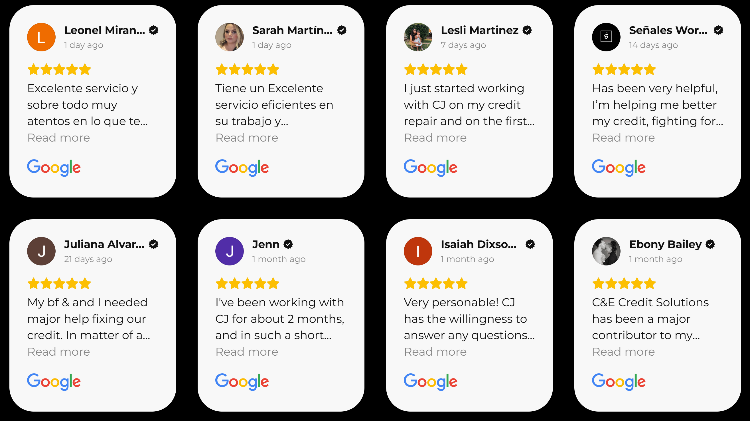
Customer satisfaction
Including google reviews builds trust
Search and Usage
Making it easier for our users to find what they want will increase our sales and retention.
Results
The results showed that most visitors use their phone when browsing online. It also revealed that they had issues had some issues with trust.
With this information the website was made with a mobile first approach of over 50% of users use their phones over larger screens.
Trust was the most important aspect of the research found.
This meant including accreditations, using colors that inspire trust, and using a professional tone.
Brand Guidelines
C&E Credit Solutions’ brand identity is professional, approachable, and consistent across all touchpoints. The tone and voice are clear and supportive, designed for busy professionals avoiding jargon, and using reassuring language to build trust.
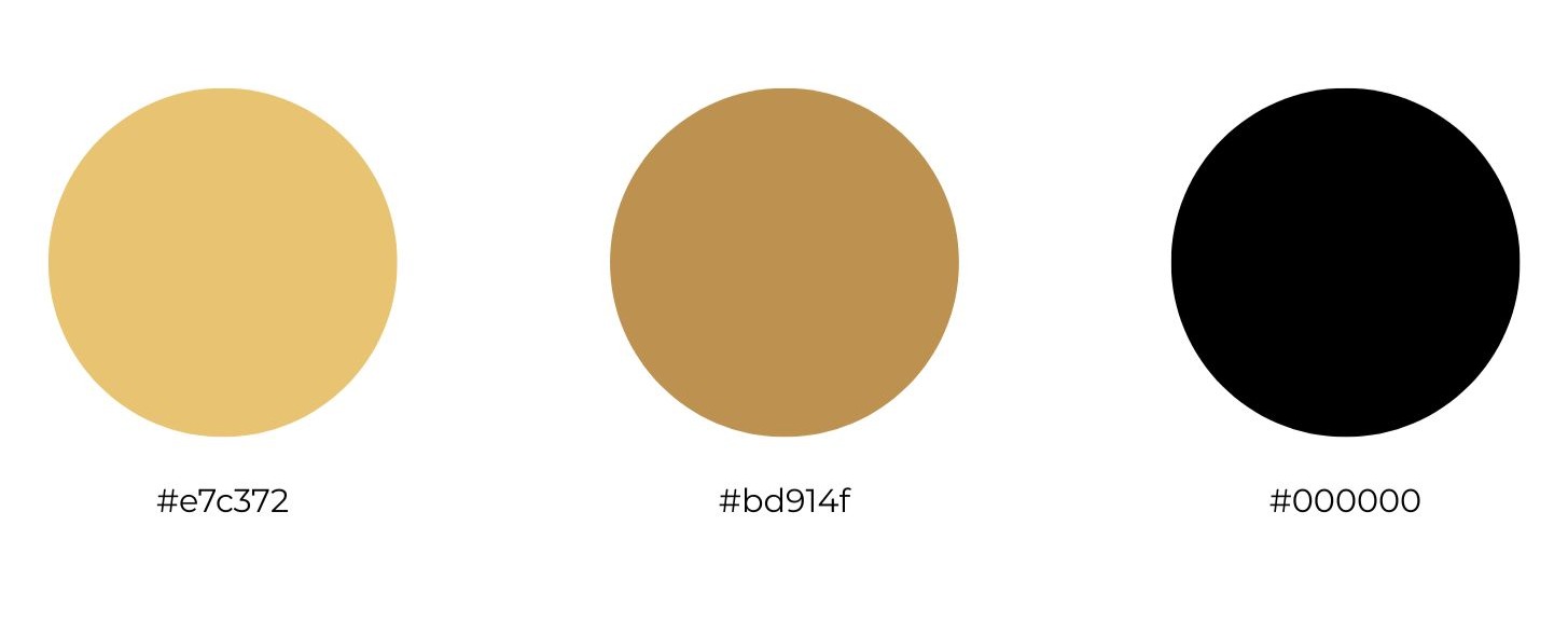
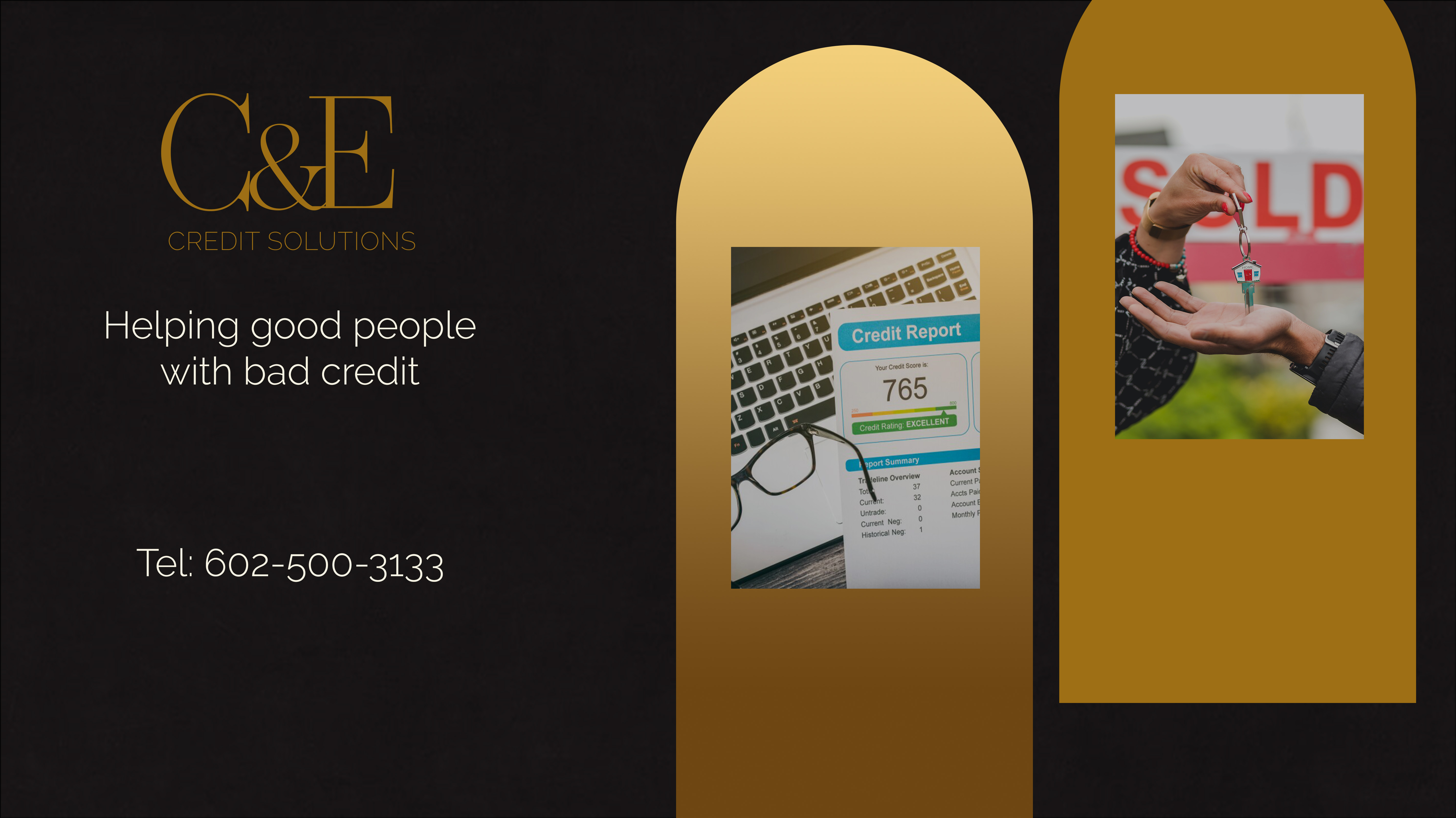
The visual identity features a clean logo with approved spacing and color use, a palette of professional black tones with neutral accents, and modern, readable typography (e.g., Montserrat, Open Sans). Imagery highlights professionals in authentic settings, while simple line icons support navigation and clarity.
Brand applications follow these standards throughout social media, and ads ensuring a cohesive look and message across all platforms.
Social Media
Using brand colors, tone, and logo across all outreach channels like Facebook.
Wireframe
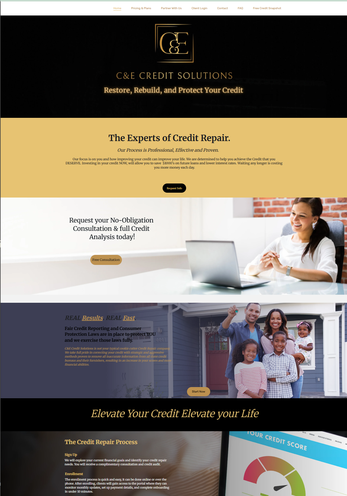
The CE Credit Solutions website is built on a clear hierarchical structure that ensures easy navigation and a smooth user experience. Top-level menu item like About, Pricing & Plans, FAQ, Contact, and Client login are organized to help users quickly find what they need.
User paths are intentionally designed to guide visitors through a clear journey: from learning about offerings to browsing courses and enrolling.
The layout follows modern design principles, with a clean, intuitive interface and full mobile responsiveness, ensuring the site functions seamlessly across all devices and screen sizes.

Takeaway
Understanding the overall needs for both the user and the business is paramount. After a few design reviews a final design was approved.
