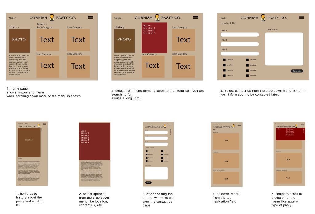
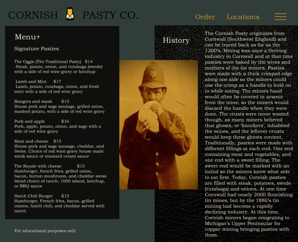
Cornish Pasty Co

About

Vibe

Cornish Pasty Co serves traditional pasties and a punk rock feel. Their restaurants feel cozy with a moody edge.

Problem

They have been expanding their business and need a new website that has the same aesthetic online as it does in the restaurant.

User feedback

It’s described as “overly simple” and “living in the 90’s.”

Client:

Cornish Pasty Co

Tools Used:

Adobe Photoshop and Illustrator

Focus:

Brand and Website

Audience

The average customer is between 25-55 and visited the website on their phone to browse the menu. The restaurant has a pub feel which attracts people that want to sit down, get a couple of drinks, and talk with their friends.

Problems

When observing the website and taking a poll with other Cornish Pasty lovers and possible clientele there were a few issues we needed to focus on

  • The menu
  • The aesthetic

Mood board

Every detail in the restaurant is thought about. They know their patrons so well. They serve good food and all the beer or cocktails they could need. The punk rock music they play reminds you of 80’s punk bands in London.

Logo

Taking inspiration from the miners in England, a logo was born. This logo would be used as a favicon and for the short version of full logo. The restaurant takes pride in its roots and I wanted their logo to reflect that.

Wireframe

I wanted to focus on communicating the overall idea rather than the specific details. Starting with mobile first since over half the population accesses websites through their phone. The users will likely view the website on their phones since there is a QR code to display the menu on their table.

User’s Journey

The wireframe is set up to show the user’s journey form start to finish. It was important to think about what the user is thinking and make the flow of the website align with what the user would be doing.

The home page on mobile

Pasties are not common in the US new customers are not going to know what pasties are. It’s helpful to have a backstory so that before the server arrives to the table they know what’s going on.

The menu on mobile

Usability is fundamental to the success of a website. To make it easier for the user it was important to have a way to filter through the menu. This way of sorting the menu will make it more efficient to decide what to order.

Before

After