Mood board
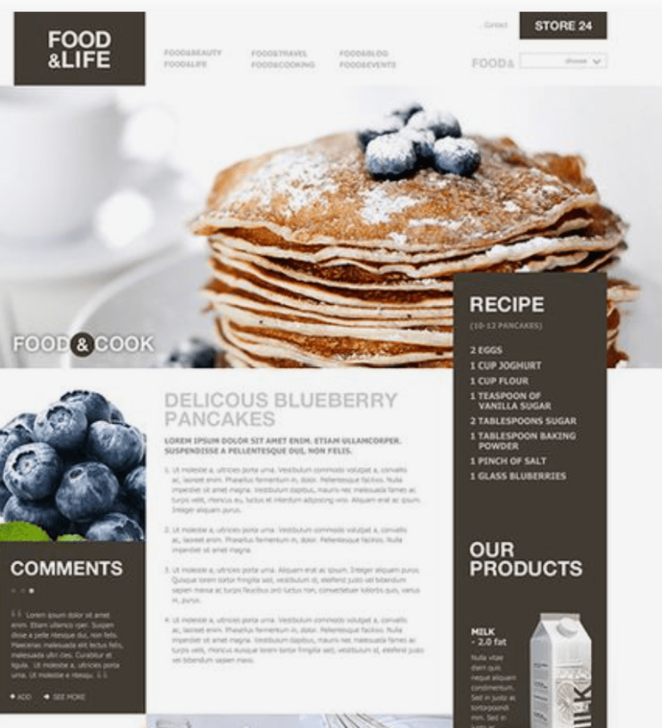
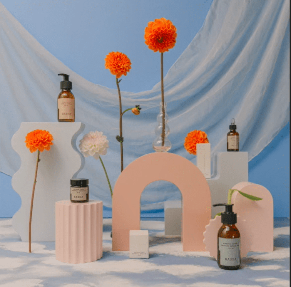
Mexican food is supposed to be fun and our audience is excited about making these dishes. The colors used for this website should be lively but not overstimulating. A given color was a bright orange so sticking with that the search was on for colors that could go well with that. Right away we found the image with the orange flowers worked well as a starting point. We also needed an idea for the layout and found the website with the pancakes as a good reference.
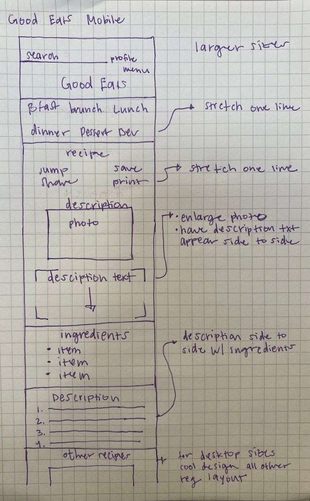
Sketches
Mobile first is typically the best way to start and that is especially true for our website. The audience is going to pull up this recipe on their phone and follow along. The sketch made was only for mobile and assumed portions would just be added side by side or displayed in a fun way.
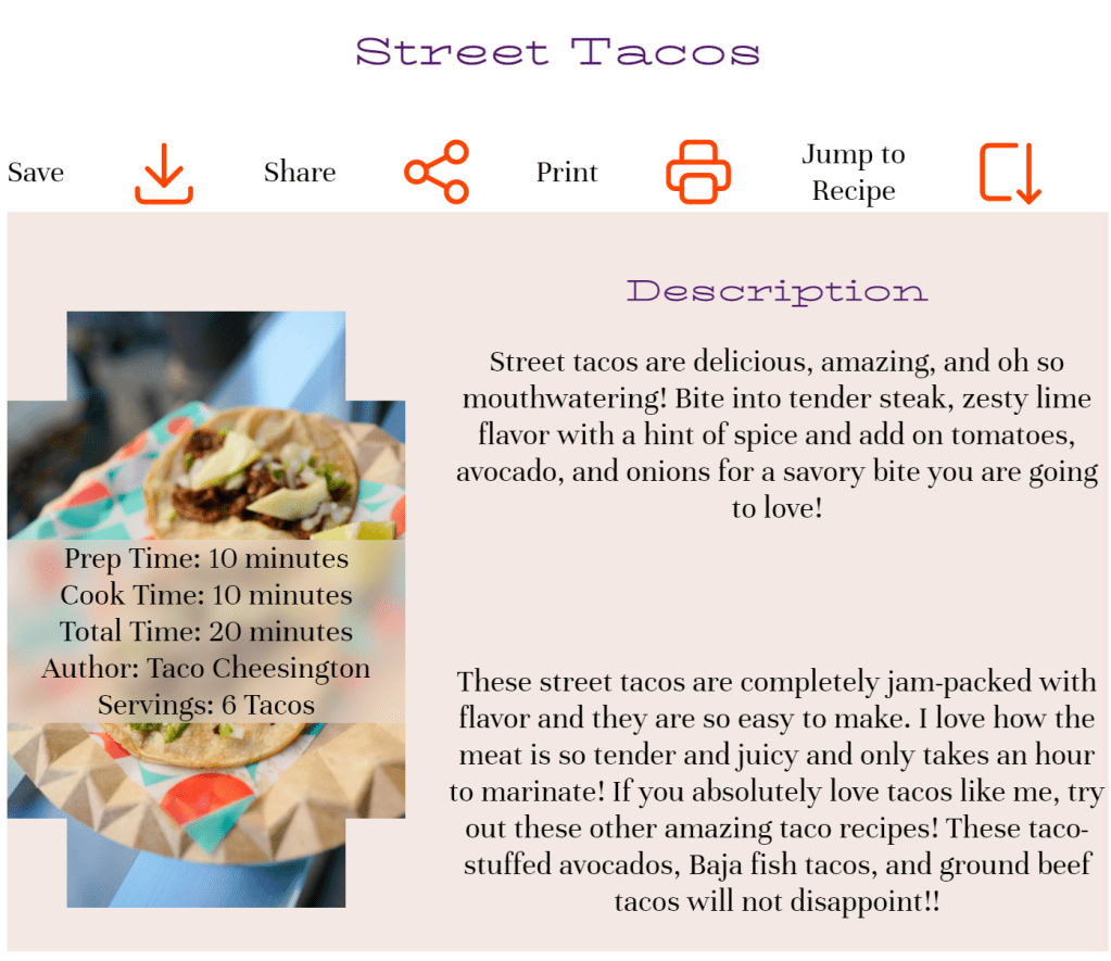
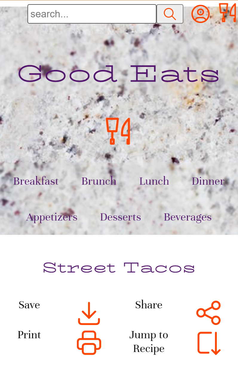
Mobile street tacos recipe page
The marble used in the backdrop was reminiscent of a kitchen countertop and almost looked like a tortilla. Readability was the first concern when selecting the colors to be used. The bright orange ads a fresh feeling and the darker purple helps with readability.
A clipping effect was applied to keep things interesting with the mobile description image that feels like patterns seen on Mexican blankets.
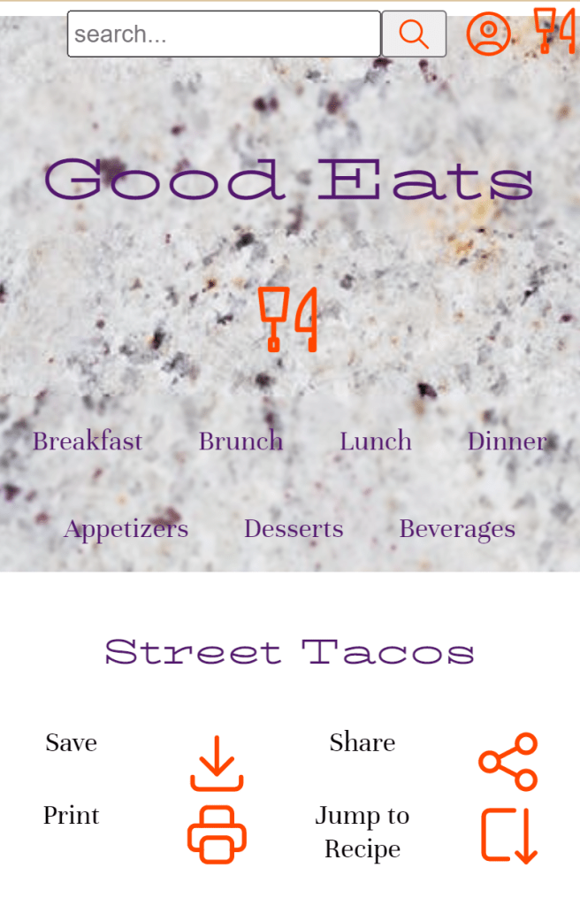
The “jump to the recipe” button at the top would drop off our reader at the ingredients section
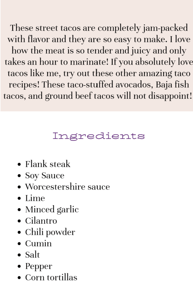
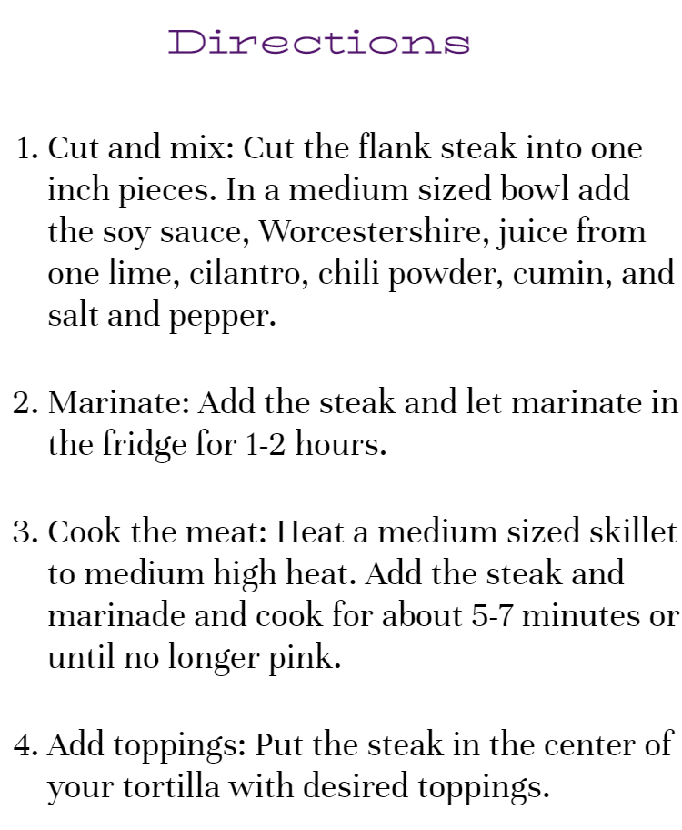
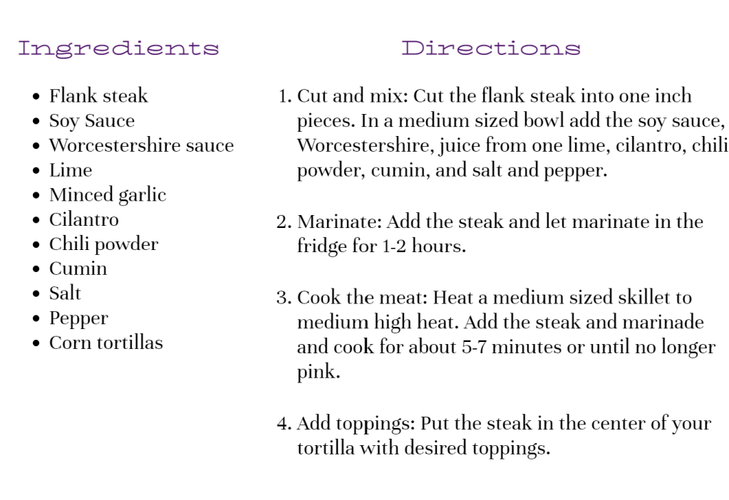
A clean easy-to-read set of directions is important to our audience. The website should not be distracting in any way. Our audience has a busy life with kids and work. It’s important for them to easily navigate the recipe.
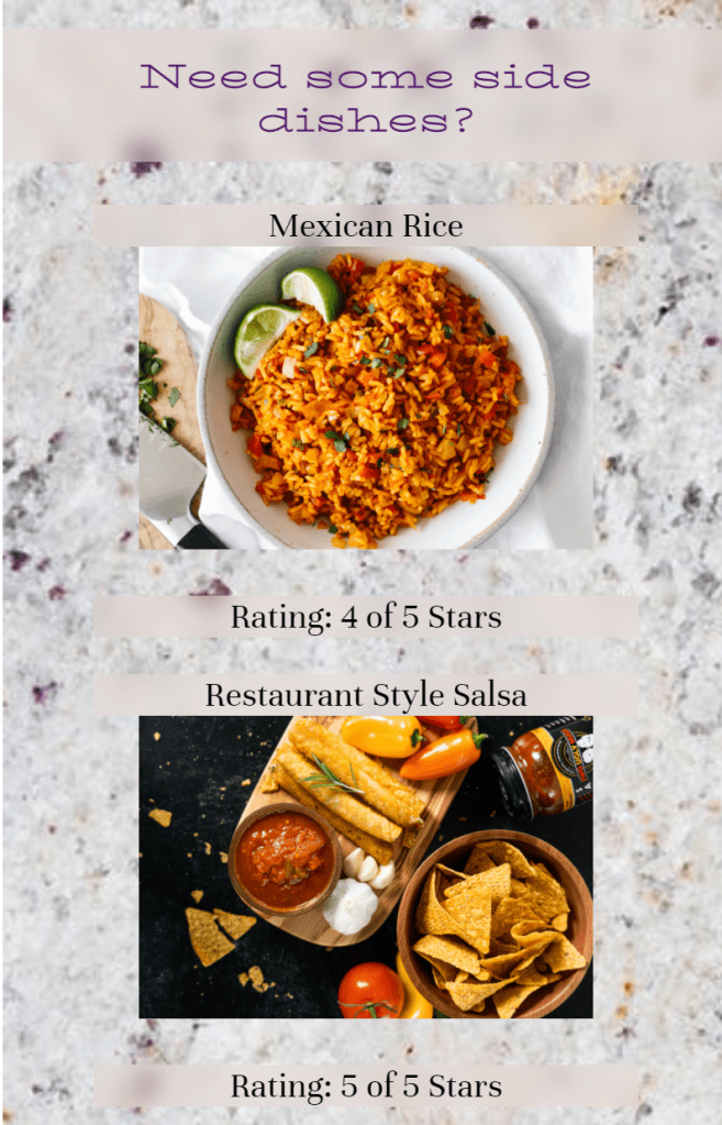
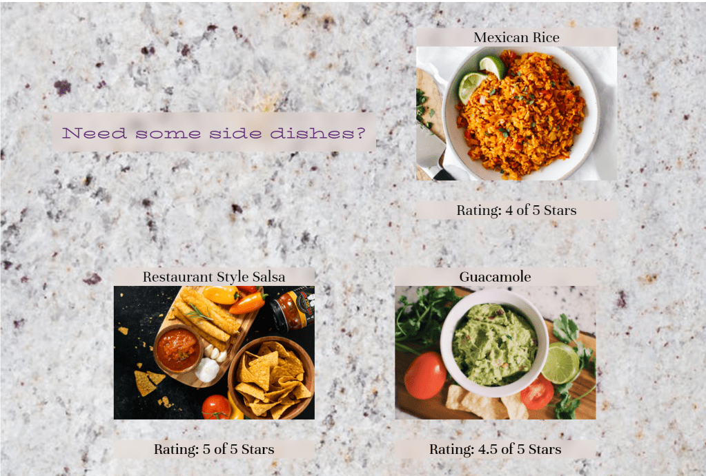
If looking in advance, our readers may want to pair their dish with some sides and not just have tacos. The website provides a link to items that would pair well with what they are making. Further down are links to options for different parts of the day in case they are planning meals for the rest of the week and not just the day.
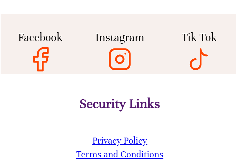
Keeping the colors of the website throughout was important even down to the icons used for socials. This helped create a sense of togetherness throughout the page that made everything feel balanced.
Tablet size
Larger sizes
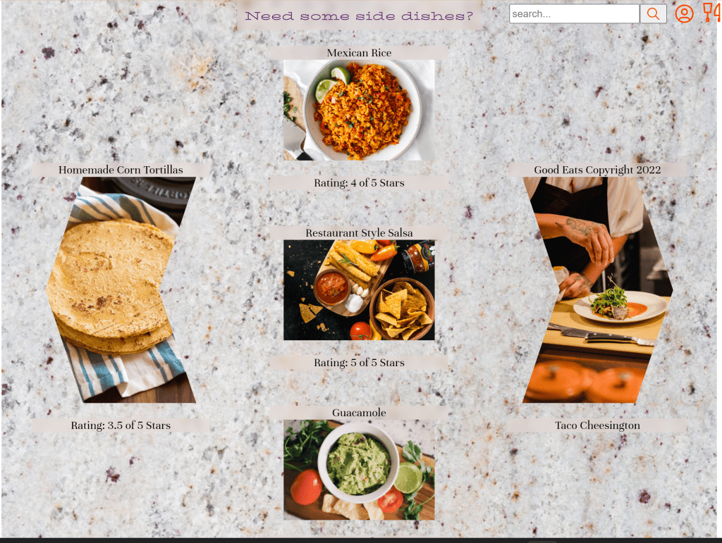
For a bit more fun and since the space was available another layout for the photos was included. The design was meant to again be reminiscent of a Mexican blanket. This helps continue the pattern and still feels like it belongs to the website but is slightly different.
Let’s talk about it
The marble backdrop was appealing, but it occasionally made itself too present. “Good Eats” was harder to read despite the blur effect added, which should have been spread throughout not just at the header and page nav bar. The logo did not need to be presented in the center when it was already at the top nav bar. The logo should be on the top left-hand corner of the page where it is expected to be. This would make it easier for our users.
When on mobile there should be a hamburger button on the right which can house the profile as well as the site navigation which could include “breakfast, brunch, lunch, dinner, appetizers, desserts, and beverages”. Content is king so by just being able to move that up a little and see more would’ve made the user of the site happier.
The buttons under street tacos could’ve been moved to the bottom of the recipe because it makes more sense to save a recipe after having seen the recipe than reading it, scrolling back up then saving it. It’s too many steps. The only necessary button up there is “jump to recipe”.
 Felicia's Portfolio